The Austin Stone, a large multi-location organization in Austin with over twenty years of history, had grown beyond its original visual identity. Decades of organic evolution left them with inconsistent branding across campuses, ministries, and sub-organizations—each with their own aesthetic sensibilities and practical needs.
As Design Team Manager, I led a team of designers and project managers through a comprehensive rebrand that needed to honor the organization’s legacy while creating a system flexible enough to accommodate their many sub-brands and future growth.
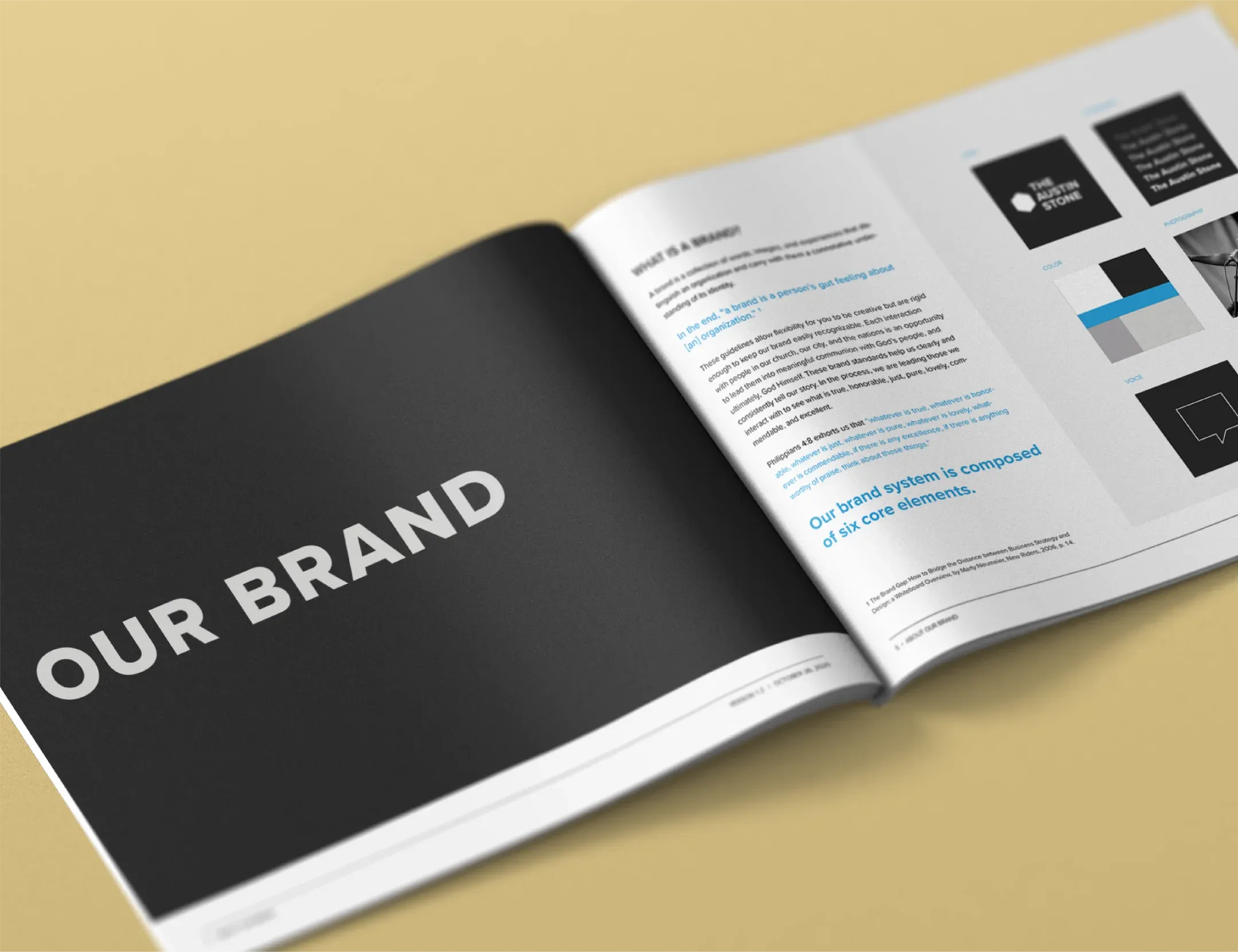
Understanding the Landscape
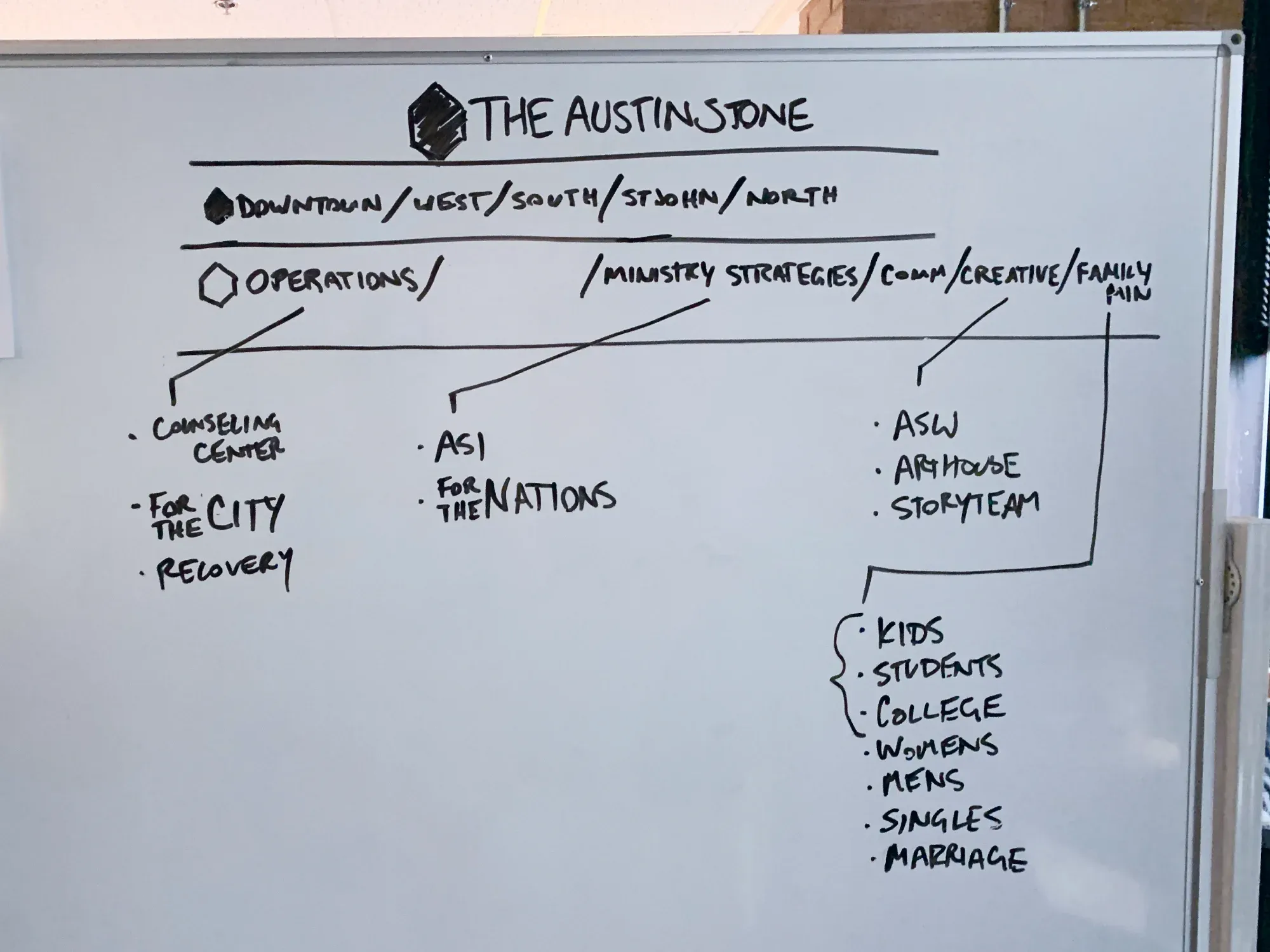
Before designing anything, we needed to understand what we were working with. The Austin Stone operates multiple campuses across Central Texas, each with distinct community identities. Beyond the campuses, dozens of ministry initiatives, community programs, and partner organizations all carried some version of the brand.
We conducted extensive user research—surveys, interviews, and focus groups—to understand how different audiences connected with the existing brand. Long-time members had deep emotional attachments to certain visual elements. Newer members found the inconsistency confusing. External partners struggled to represent the organization accurately.
This research revealed our core challenge: create something fresh that could unify the entire organization without erasing the twenty years of history that made it meaningful.

A Modular Foundation
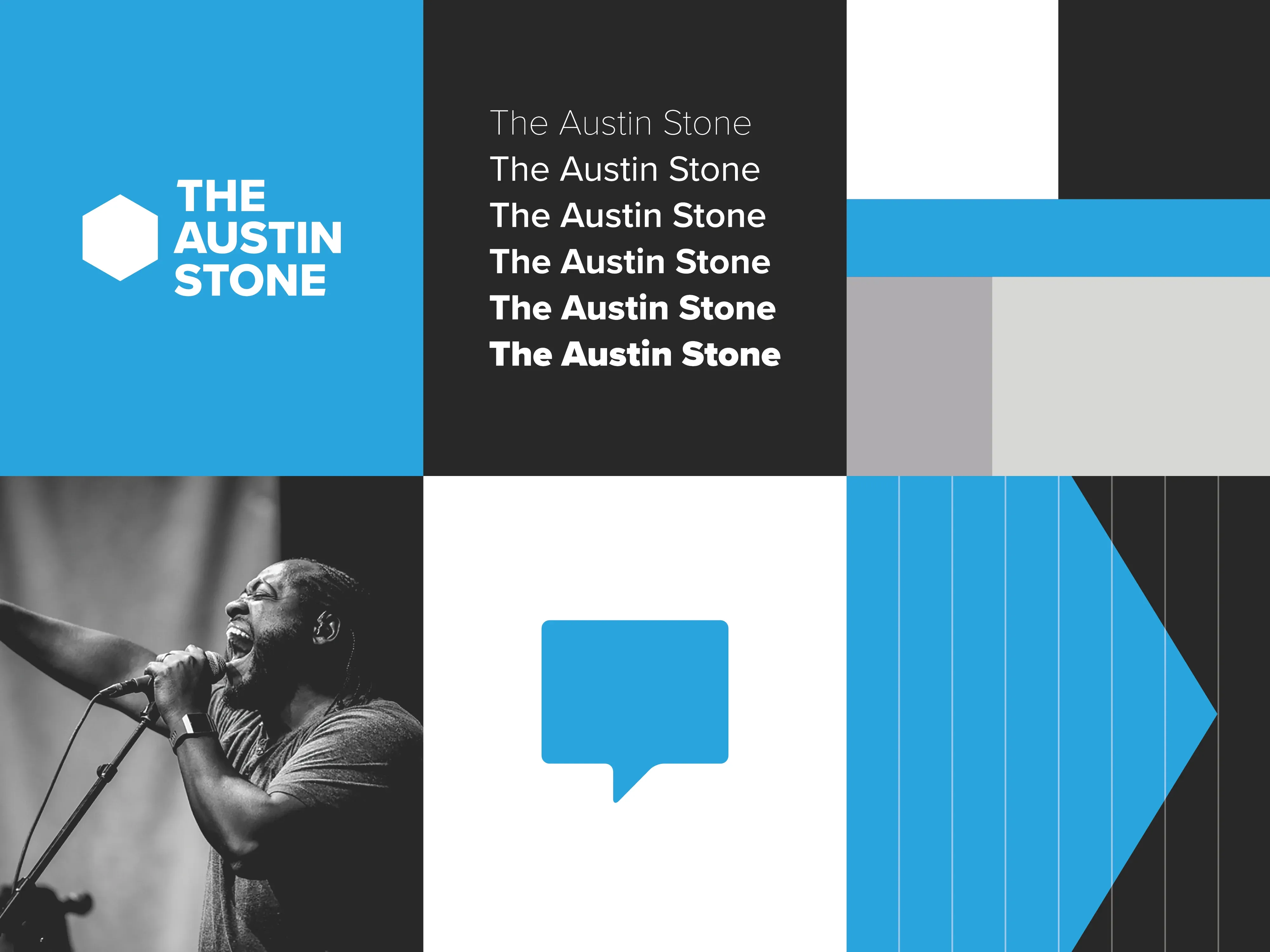
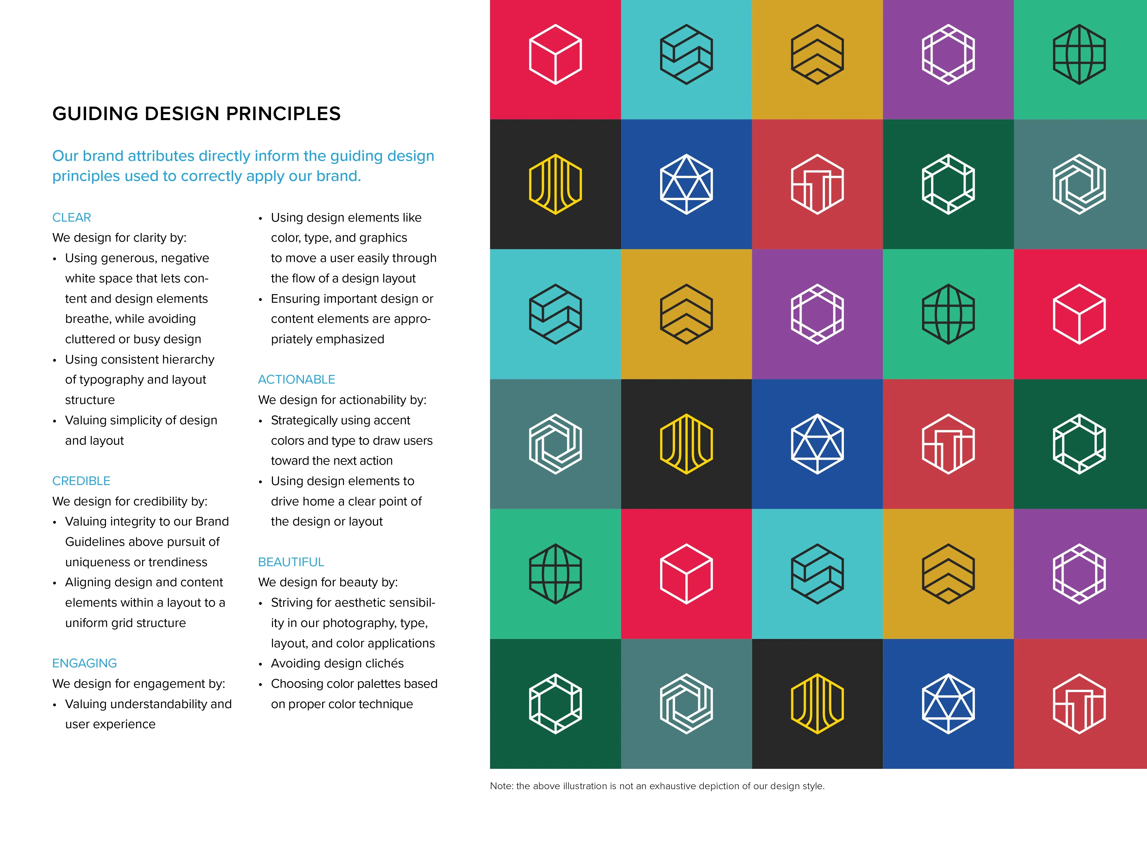
The breakthrough came from a simple geometric form: the hexagon. Hexagons tile infinitely without gaps, create visual interest through combination, and carry symbolic weight—cells in a honeycomb, organic growth, interconnected communities.
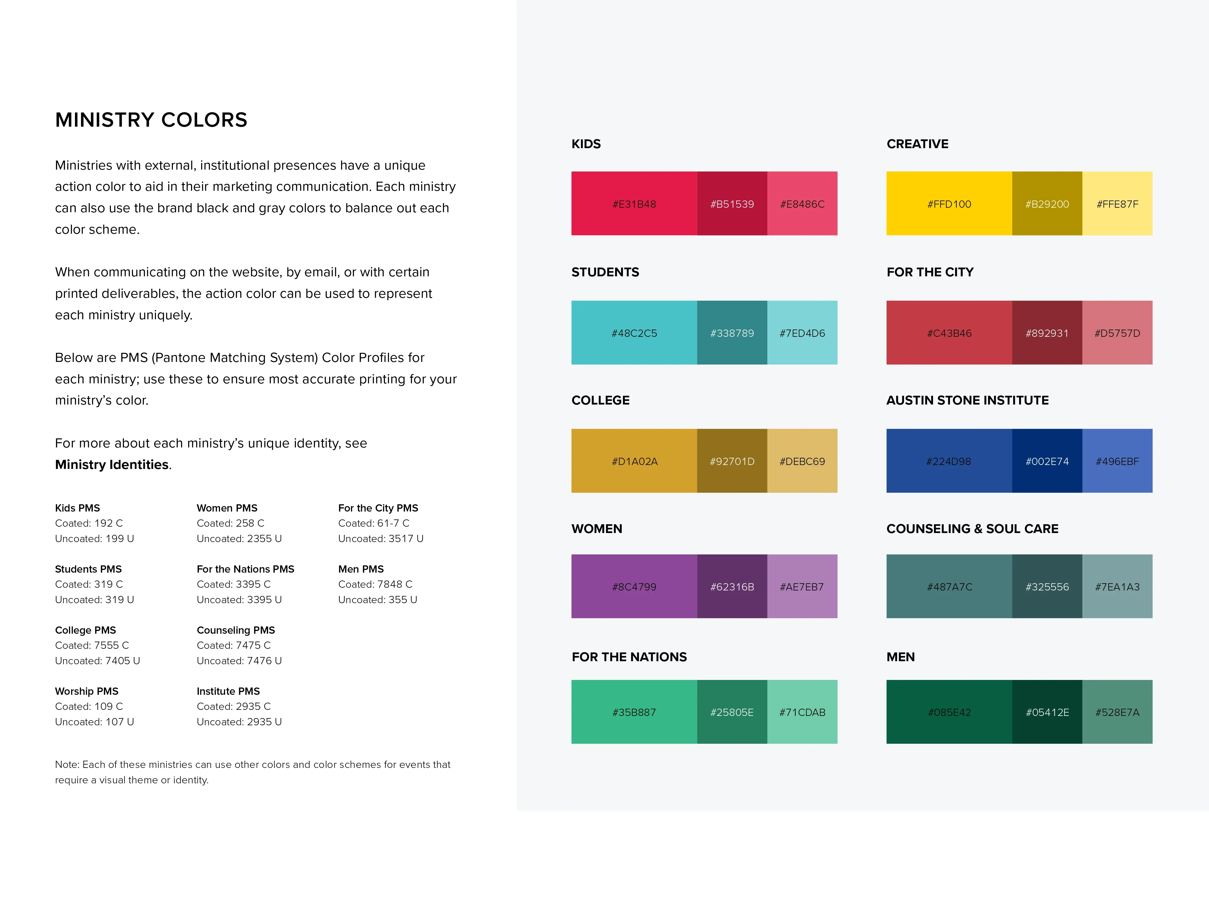
We built the entire brand system on this foundation. The primary logo incorporates hexagonal geometry. Sub-brand marks use hexagon variations that clearly belong to the family while maintaining their own identity. Color palettes, pattern systems, and graphic devices all reference the hexagon in subtle and overt ways.
This modular approach solved our flexibility problem. A campus could have its own distinct mark while obviously belonging to The Austin Stone. Ministry initiatives could develop unique visual expressions without fragmenting the overall brand. The system grew by addition, not exception.
Testing With Stakeholders
A rebrand at this scale affects hundreds of staff members, volunteers, and partner organizations. We couldn’t afford to finalize decisions in isolation and hope for adoption.
Throughout the process, we involved stakeholders in feedback sessions and validation testing. Concept testing revealed which directions resonated emotionally. Prototype testing showed us practical implementation challenges. User acceptance testing confirmed that the final system met both aesthetic and functional requirements.
This collaborative approach surfaced concerns early. What looks elegant on screen doesn’t always translate to embroidery. Colors that feel distinct digitally can merge in print. By testing early and often, we avoided the common fate of beautiful brand guidelines that nobody can actually implement.
Cross-Department Alignment
Brand consistency doesn’t happen through documentation alone. I led collaboration efforts between marketing, communications, and program teams to ensure the new identity would be understood and correctly applied across all departments.
This meant different things for different teams. The digital team needed specifications for web and app implementation. The print team needed templates and file preparation guidelines. The events team needed signage standards and environmental graphics direction. Partner organizations needed clear guidance on co-branding and attribution.
We built comprehensive brand standards addressing all these contexts, but more importantly, we built relationships with the people who would use them. Training sessions, office hours, and a culture of accessible brand guidance made the difference between guidelines that gather dust and a system that actually unifies.
The System in Practice
The final brand system includes a refreshed primary mark, a complete sub-brand identity framework, extensive color palettes tailored for both digital and print applications, typography guidelines, photography direction, and a library of graphic elements and patterns.
Each sub-brand receives its own colorway and mark variation while sharing the core typographic and structural elements. This creates visual distinction where it matters—a campus should feel different from a community program—while maintaining the family resemblance that signals organizational unity.
Implementation and Impact
We rolled out the rebrand across all channels: updated websites, refreshed social presence, new printed materials, signage, and environmental graphics. The transition happened over several months, with priority given to high-visibility touchpoints while back-catalog materials cycled out naturally.
The comprehensive rebrand has been well-received across all stakeholder groups. Staff report feeling more confident representing the organization. Partners find co-branding straightforward. Most importantly, the system has proven durable—years later, it continues to accommodate new initiatives and sub-brands without requiring fundamental changes.
In 2023, we returned to extend this brand foundation into a modern, mobile-first digital experience for the organization’s web presence.
In collaboration with The Austin Stone design team