Four years after completing The Austin Stone’s comprehensive rebrand, we returned to extend that brand foundation into a modern digital experience. The 2019 brand system had proven durable for print and environmental applications, but the organization’s web presence had evolved separately—functional, but lacking the visual coherence and intentionality of the brand standards we’d established.
As Lead Designer, I led the development of a complete UX/UI design language that would bring the digital experience into alignment with the broader brand while addressing the unique challenges of mobile-first, accessible design.
Building on Established Foundation
The advantage of extending an existing brand system is clarity of constraints. We weren’t making aesthetic decisions from scratch—the color palette, typography hierarchy, and visual grammar already existed. Our task was translation: how do these brand principles manifest in interactive digital contexts?
We began by auditing the existing digital presence against the brand standards. Where did they align? Where had they drifted? What worked well despite inconsistency, and what caused friction? This audit revealed opportunities and pitfalls, helping us prioritize where investment would yield the greatest returns.
User Research for Digital Context
Print brand standards don’t anticipate mobile viewports, touch targets, or screen reader compatibility. We conducted fresh user research focused specifically on digital interactions: how members accessed information, what devices they used, where they encountered friction, and what mental models they brought to the organization’s digital tools.
Surveys, interviews, and contextual inquiries revealed a heavily mobile user base accessing the site in brief sessions—often during services or immediately after, looking for specific information. This shaped our mobile-first approach: primary use cases needed to work flawlessly on phones, with desktop experiences expanding rather than fundamentally changing the interaction model.
A Cohesive Design Language
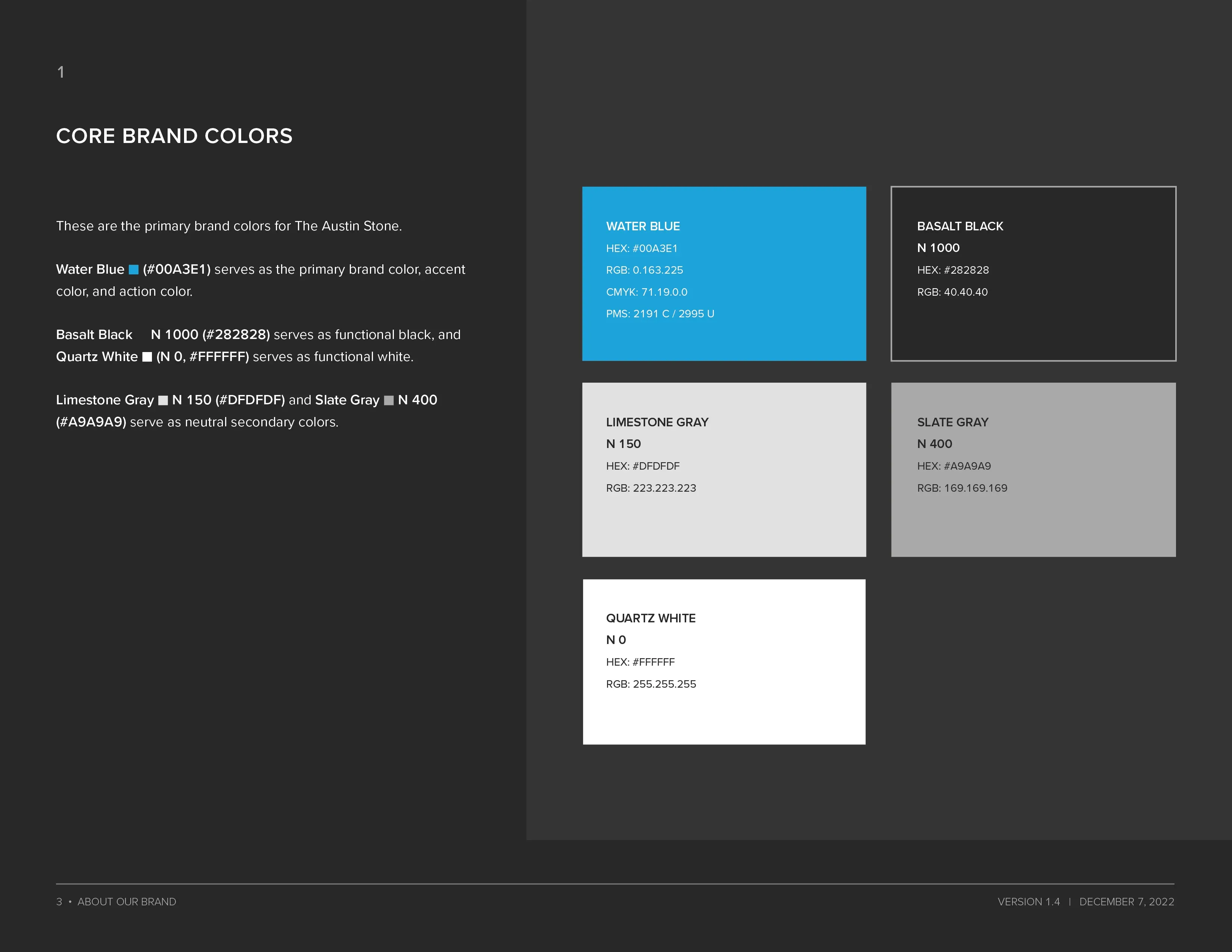
We developed a comprehensive UX/UI system covering every aspect of the digital experience. Brand colors translated into an accessible palette with sufficient contrast ratios and clear semantic meaning—what colors indicate interactive elements, what colors signal status or feedback. Neutral tones provided the scaffolding for content without competing with brand expression.
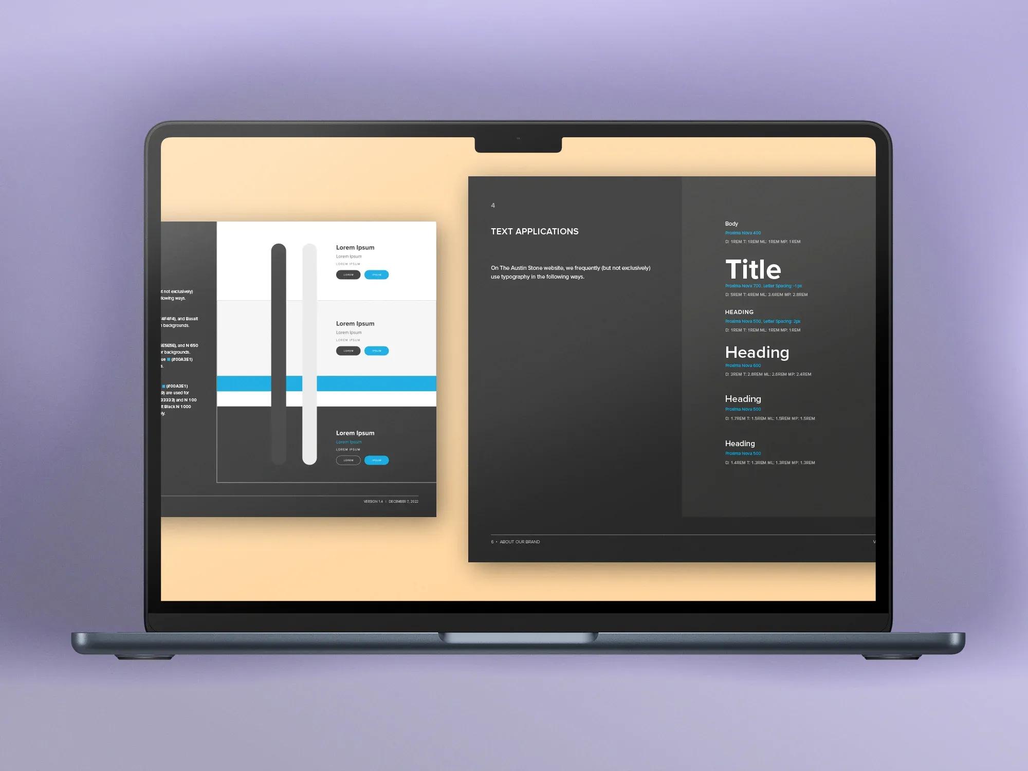
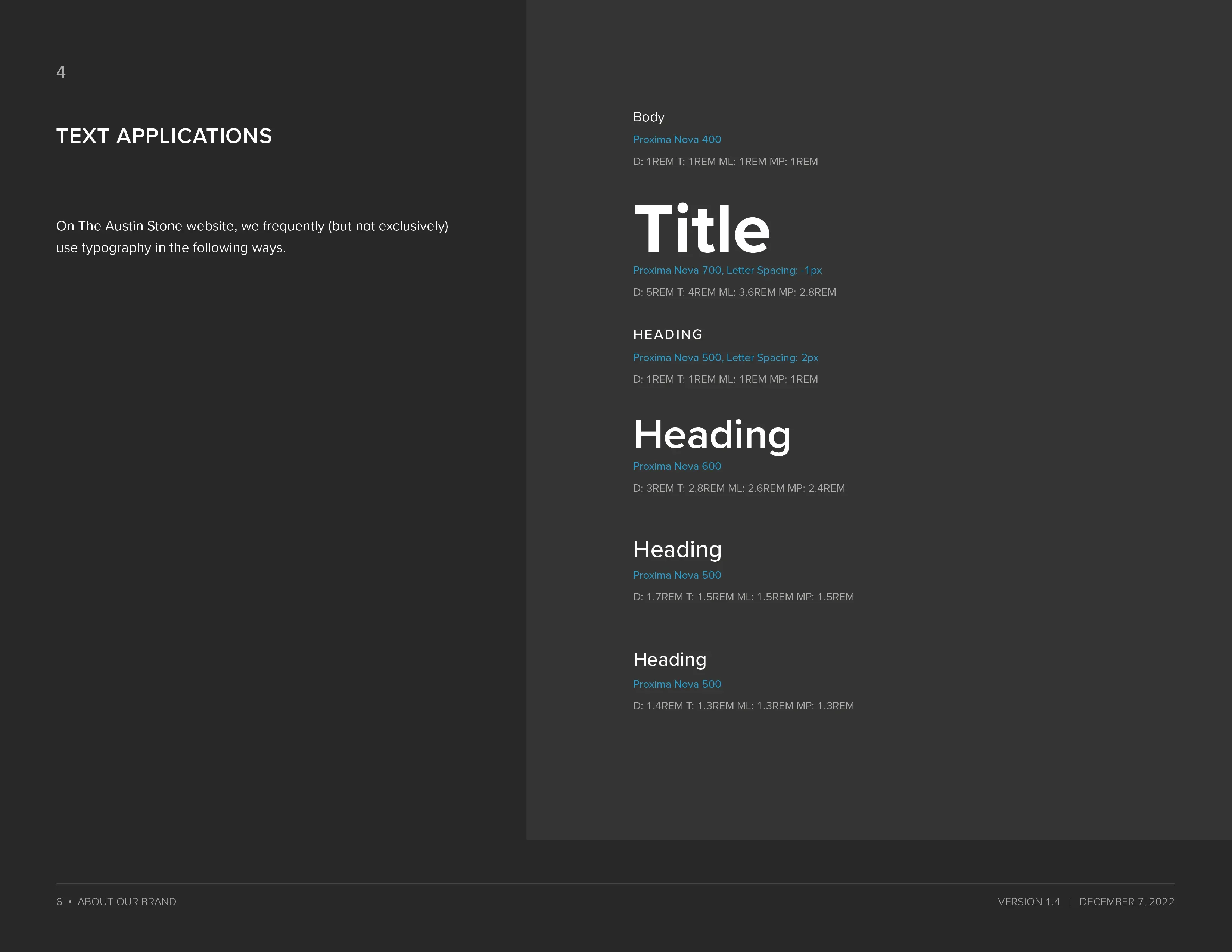
Typography specifications addressed the practical differences between print and screen: adjusted sizing for device contexts, line heights optimized for reading on backlit displays, weight variations for establishing hierarchy in constrained spaces. The brand’s typographic personality persisted while adapting to technical requirements.
Component Architecture
Beyond colors and type, we built a library of UI components that could be composed consistently across the organization’s various digital touchpoints. Buttons, form elements, cards, navigation patterns—each component specified in multiple states (default, hover, focus, active, disabled) with responsive behavior documented.
This systematic approach served multiple goals. It accelerated development by providing clear specifications. It ensured accessibility by building WCAG compliance into component definitions rather than retrofitting. And it created consistency that reinforced brand recognition across different applications and platforms.
Front-End Implementation
A key architectural decision was building on Webflow. The organization didn’t have—and wasn’t going to hire—dedicated web developers. Whatever we built needed to be maintainable by content editors and marketing staff long after my involvement ended. Webflow gave us a visual CMS, managed hosting, and a publishing workflow the team could own without writing code.
But Webflow’s native capabilities alone wouldn’t deliver the level of craft and accessibility the project required. We layered custom code on top of the platform: CSS custom properties for design tokens (spacing, color scales, type sizing) and custom responsive behavior that went beyond Webflow’s built-in breakpoint system. This hybrid approach—Webflow’s content management and publishing paired with hand-written front-end code—gave us the best of both worlds.
Accessibility was a first-class requirement, not a retrofit. The component library was built to WCAG 2.0 AA / Section 508 standards from the start: semantic HTML structure, proper heading hierarchy, ARIA landmarks and labels, visible focus indicators, and sufficient color contrast ratios verified against both the brand palette and all semantic color applications. Interactive components were built with full keyboard support and screen reader compatibility—details that required custom implementation beyond what Webflow provides out of the box.
The responsive system used a fluid approach with CSS custom properties for spacing and sizing, reducing breakpoint-specific overrides in favor of intrinsic layouts. Components adapt to their container context rather than to specific viewport widths, which made them composable across different page templates without additional responsive work.
Cross-Department Adoption
A design system only matters if people use it. We collaborated closely with developers, content creators, and marketing specialists to ensure the new standards could be practically implemented across all digital platforms—the main website, internal tools, email communications, and partner-facing resources.
This collaboration surfaced implementation challenges early. Some design choices proved technically expensive; we adjusted. Developer concerns revealed edge cases we hadn’t considered; we expanded the system. The final result reflected both design aspiration and engineering pragmatism.
We provided training and documentation to help various sub-organizations adopt the new standards. Brand consistency across a large organization requires more than guidelines—it requires accessible resources, clear examples, and ongoing support for the people doing the implementation work.
Results and Ongoing Impact
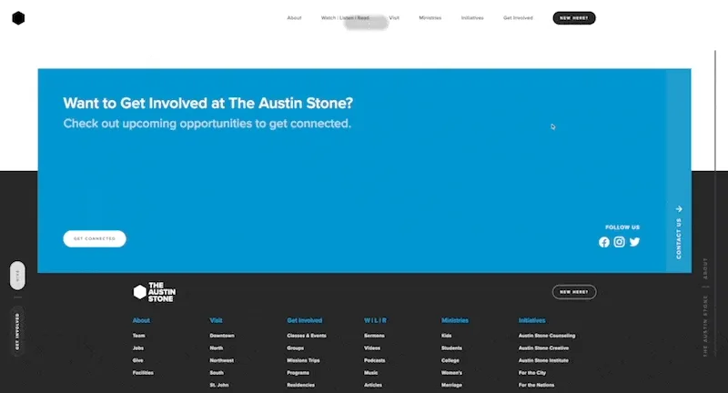
The refreshed UX/UI design standards launched across the organization’s digital presence, most visibly at austinstone.org. Reception has been positive from both internal stakeholders and external users, with the design system now serving as the foundation for all digital work across the organization.
The Webflow decision has proven especially durable. Years after the initial build, the organization’s staff continues to publish content, update pages, and maintain brand consistency without engineering support. The custom code still runs beneath the surface—enforcing accessibility standards, powering interactive components, and maintaining the design token system—while the team manages day-to-day content through Webflow’s visual editor. The platform outlasted my involvement by design, which is the best outcome an engagement like this can have.
In collaboration with The Austin Stone design and communication teams