Words for Winter is a hardbound collection of meditative poetry and liturgies covering the seasons of Advent and Christmas. The project called for something that felt timeless—a physical object worthy of returning to year after year, designed to evoke the warmth and weight of vintage devotional books while remaining accessible to contemporary readers.
As Lead Designer, I collaborated with writers, editors, a publisher, and a printer to develop every aspect of the book’s visual identity, from the gold-foiled cover to the meticulous interior typography.
Understanding the Format
Book design operates under different constraints than digital work. The object itself carries meaning: weight, texture, and craft signal care and permanence in ways that pixels cannot. For a book intended to accompany quiet moments of reflection across Advent and Christmas seasons, these material qualities mattered as much as the visual design.
I conducted research with the target audience—individuals and small groups who would use this book as a devotional resource—to understand their preferences and expectations. How did they interact with similar books? What made them return to certain volumes year after year? What physical qualities signaled that a book was worth keeping?
This research shaped fundamental decisions about format, paper stock, and binding before visual design even began.
An Art-Nouveau Sensibility
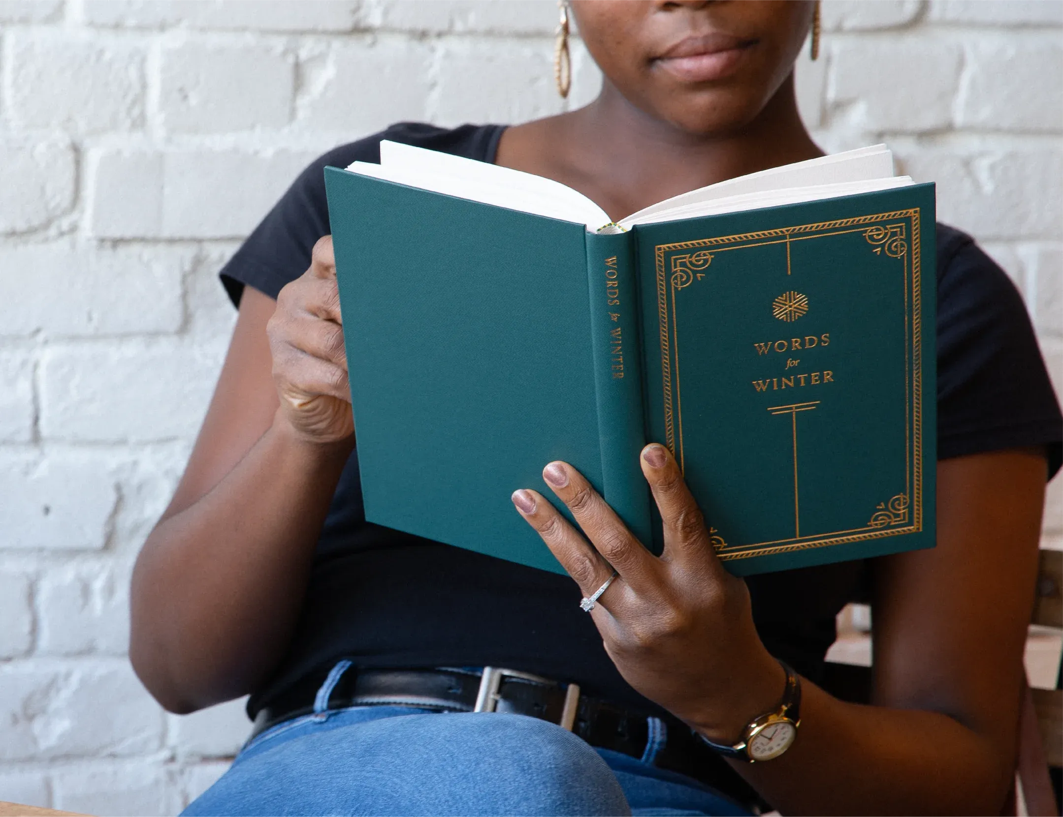
The cover needed to convey warmth, elegance, and a sense of history without tipping into kitsch. I developed an intricate Art-Nouveau-inspired design featuring organic forms and deliberate symmetry, executed in gold foil on a deep, rich cover stock.
Art Nouveau felt appropriate for several reasons: its emphasis on craftsmanship aligns with the care taken in the written content; its organic forms reference the natural rhythms of seasonal observance; its historical associations evoke a time when devotional books were treasured objects. The gold foil adds tactile richness and catches light in ways that reward handling.
The back cover and spine continue the visual language in more restrained form, creating a unified object that remains elegant from every angle.
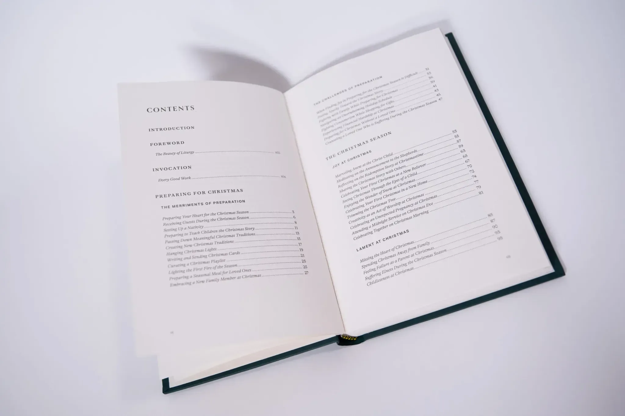
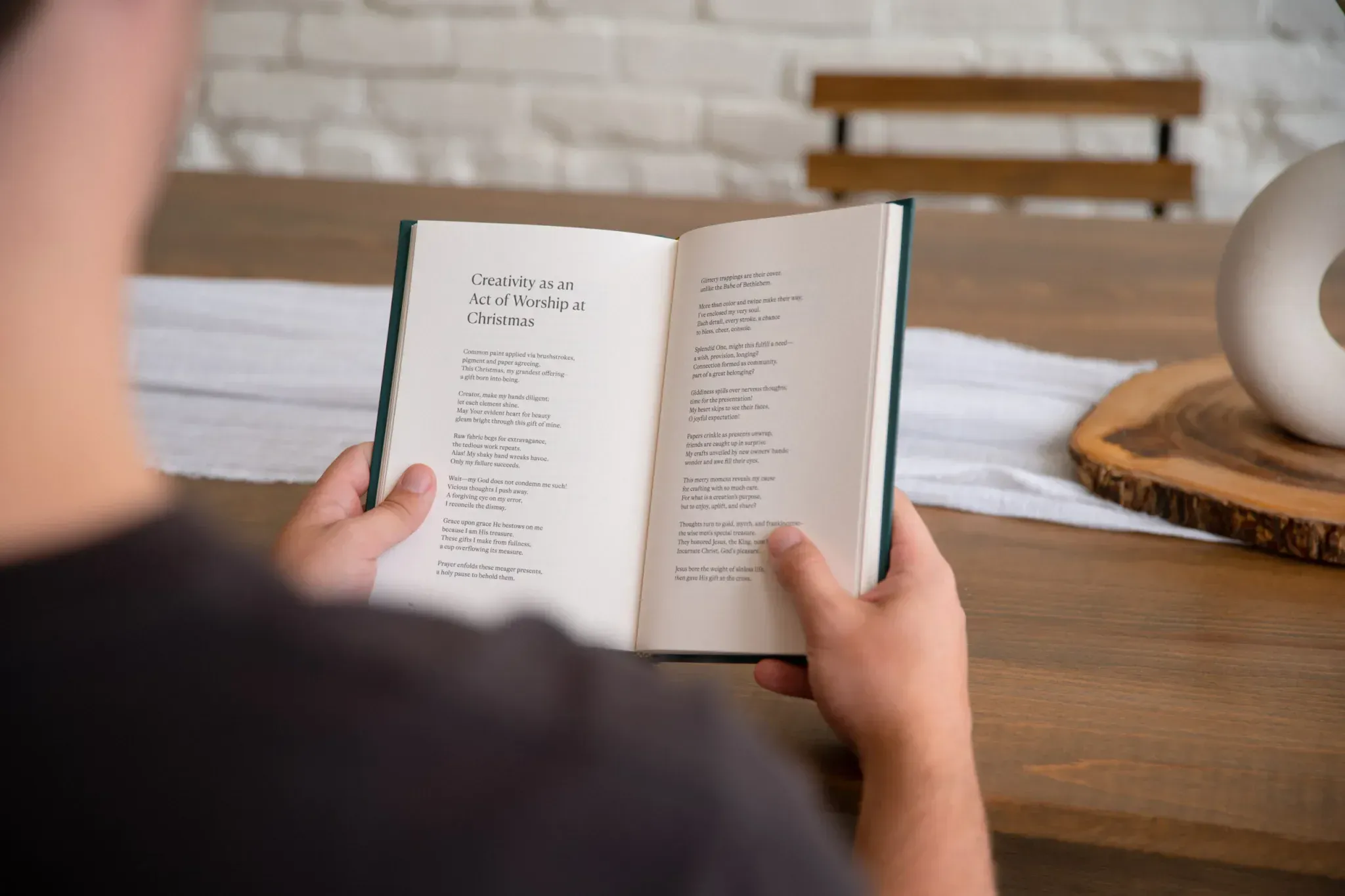
Interior Typography
The interior design prioritized two competing needs: readability for extended use and visual character that matched the cover’s craftsmanship. Poetry and liturgy demand precise typography—line breaks carry meaning, white space enables contemplation, and the rhythm of the page should support the rhythm of the words.
I developed a typographic system using a classic serif face with generous leading and margins that create breathing room around each piece. Section openers establish hierarchy and visual interest, while body pages maintain consistent, calming structure. Ornamental elements appear sparingly, punctuating sections without overwhelming the text.
Paper selection balanced printability, durability, and feel. The final choice offers slight texture that’s pleasant to handle, sufficient opacity to prevent show-through, and a warm tone that complements the typography without straining the eyes during extended reading.
Production Collaboration
Print projects live or die by production quality, and production quality depends on relationships with printers and binders. I worked closely with production partners throughout the process, from early conversations about feasibility to press checks on the final run.
The gold foil cover required particular attention. Foil stamping involves heat, pressure, and precise registration—the intricate Art-Nouveau design pushed these tolerances. We ran tests on multiple foils and cover stocks to find the combination that captured detail without loss or burnishing. The final result rewards close inspection: every line and curve rendered cleanly.
Binding decisions affected both aesthetics and durability. The hardbound case binding creates a substantial object that lies flat when open—important for group settings where the book might rest on a table during shared reading.
Extending the System
While the primary deliverable was the physical book, the visual identity needed to work across promotional contexts. I developed adaptations for social media, email campaigns, and web presence that maintained the Art-Nouveau character while functioning in digital formats.
This cross-media consistency helped build recognition and anticipation before release, and continues to serve the book’s ongoing availability through The Austin Stone Institute.
A Lasting Object
Words for Winter has been well-received by readers who appreciate both its content and its craft. The book continues to find its way into Advent traditions, passed between friends and returned to each year as the seasons turn.
For a project centered on reflection and contemplation, that endurance feels like the right measure of success. Good design serves its content, and devotional content asks to be returned to. The physical qualities of this book—its weight, its texture, the warmth of its cover in hand—support that returning.