Zello’s homepage hadn’t been meaningfully updated in years. An earlier MVP effort had replaced an aggressively rugged consumer brand presentation with a more professional look, but the site still didn’t serve the company’s strategic shift toward enterprise customers.
The Problem
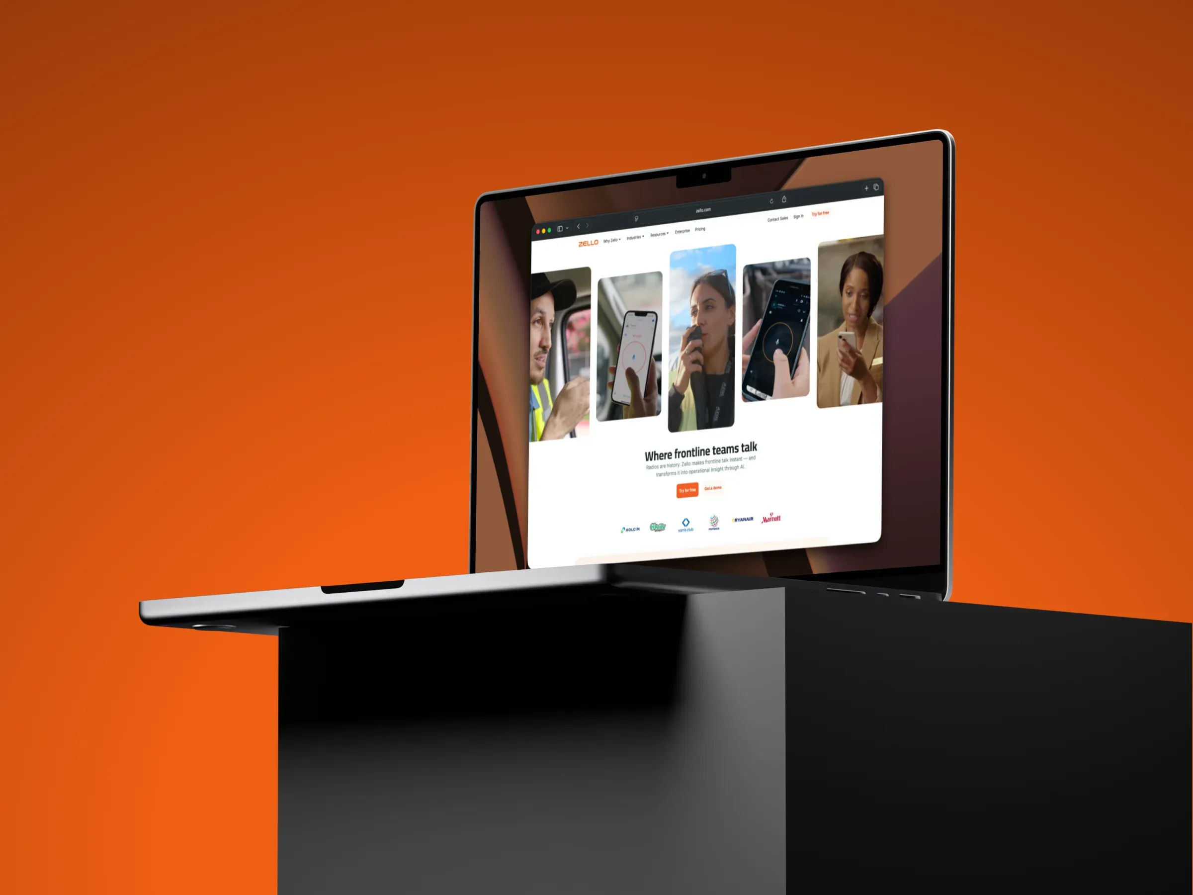
The existing homepage had several critical gaps. There was no photography showing how the product is actually used in industry contexts—logistics operations, hotel staff coordination, school safety teams. The messaging was vague, with no clear explanation of what Zello does or how it could help a specific buyer. Our AI-powered features weren’t represented at all. And the calls to action weren’t tuned for enterprise decision-makers evaluating solutions for their organizations.
The site was built on Eleventy with a component-based architecture, which gave us a solid foundation. But we needed refreshed design tokens, a more modern color palette, and a layout that spoke credibly to tech-minded enterprise buyers as part of a company-wide initiative to scale enterprise growth.
Process
I led both design and implementation over a focused three-month sprint. The pace was fast—working cross-functionally while maintaining rapid testing and feedback cycles throughout.
The design process followed a deliberate progression from low to high fidelity. Early wireframes established information hierarchy and content structure before any visual design began. This let us align on the narrative flow with stakeholders before investing in polish. From there, I moved into high-fidelity mockups in Figma, exploring visual directions that balanced professionalism with approachability—confident and modern without feeling cold or generic.
My visual designer colleague created custom illustrations that brought warmth and specificity to the industry contexts. These weren’t stock imagery stand-ins; they depicted real scenarios that our enterprise customers would recognize from their own operations.
Research and Testing
We employed user testing on a high-fidelity Figma prototype with the logo and company name obfuscated to ensure blind testing. The prototype wasn’t static mockups—it included animations, real content, photography, and interactive transitions so we could test the actual experience users would encounter.
We recruited participants matching our target buyer personas and ran moderated sessions to understand how they navigated the page, what resonated, and where they got confused. This testing validated our information hierarchy and messaging approach. We learned which industry contexts resonated most strongly, and where our original assumptions about feature prioritization were wrong.
The insights directly shaped the final design. Sections were reordered, copy was tightened, and we doubled down on the industry-specific entry points that testing showed were most effective.
Design Approach
The redesign structured the page around a clear narrative arc. The hero establishes the core value proposition while showing Zello in action across multiple industries—giving visitors an immediate “that’s me” moment regardless of their sector.
Below the hero, the App Section walks through each of Zello’s core feature value propositions with corresponding product screenshots. This addressed the fundamental clarity problem: visitors now understand what the product actually does before scrolling further.
Our AI-powered features—previously absent from the site entirely—received a dedicated section with updated color treatments and a compelling narrative around how they enhance the core Zello experience. This was critical for positioning against competitors and demonstrating ongoing product investment.
The deployment section uses card components to walk through getting Zello running in your organization—addressing the “how do I actually use this” question that enterprise buyers need answered before engaging with sales.
Customer Proof
Enterprise buyers want to see that companies like theirs have succeeded with the product. We built interactive customer story cards that surface relevant case studies based on industry and use case.
Implementation
The site runs on Eleventy with a component-based architecture that I owned and maintained. Rather than introducing a framework, I kept the stack lean—vanilla JS, modular SCSS, and a custom build pipeline—prioritizing performance and maintainability over tooling novelty.
The redesign required leaning significantly on a well-factored design token layer: color scales mapped to semantic roles (surface, text, interactive, accent), a responsive type scale, and spacing primitives that enforce consistency without requiring pixel-perfect spec handoff. These tokens became the single source of truth shared between Figma and code.
On the component side, I built reusable primitives—section containers, card patterns, CTAs, media blocks—that the marketing team can compose with. Each component handles its own responsive behavior, lazy loading, and accessibility concerns (semantic HTML, ARIA attributes, keyboard navigation, sufficient color contrast). Section animations use Intersection Observers for performant viewport-triggered playback.
The result is a system where content updates ship without engineering involvement, while structural changes remain clean and predictable.
Results
The redesigned homepage was well-received across the organization. Early signals from the page’s release showed an increase in qualified leads—visitors arriving to sales conversations with clearer expectations about Zello’s enterprise capabilities and how the product could fit their specific context.
The result is a homepage that clearly communicates what Zello does, shows the product in relevant industry contexts, highlights AI-powered capabilities, and guides enterprise buyers toward meaningful engagement.
In collaboration with the Zello Design and Product Marketing teams